Sunday, February 27, 2011
well done websites
http://www.verticalgardendesign.com/
A site to showcase the work of landscape/interior designer's work. The layout is simple which allows for the beautiful images to take center stage. Also uses nice type and white space in the layout of the site.
http://crowwwsnest.com/
I think the concept of this page is great. The take social networks such as twitter and post the top URL's from top ad and design pages and posts what is most popular every 15 minutes.
http://beautifultype.net/
A blog of beautiful found examples of great type. the structure and colors of this website are clean and beautiful. It is simple with out too many options to click on, but plenty to look at.
Outstanding Websites
http://www.stylemepretty.com/
I do quite a bit of wedding/photo research for inspiration for my business, and this is by far one of my favorite sites to use. It's frequently updated and it boasts content that has not been previously published to any other blogs. The simple use of pattern in the background is effective and decorative in a minimal way, and the photos and content are always stunning and unique.
http://digitalmash.com/
I really enjoyed this portfolio site because of its simplicity and focus on typography on the homepage. It's and easy-to-use and easily understood web layout. The designs and photography on the other pages of this site are outstanding, and they bright colors against a neutral background make this site a winner in my book.
http://www.forefathersgroup.com/
Talk about vintage, clean, and modern all at the same time! Vintage is in right now, and can be very effective when used well. This company does a great job of making some eye-catching type to draw viewers in. I already can't wait for the official launch this summer.
http://climatewisconsin.org/
Last but not least, this website is particularly interesting because it's about Wisconsin! It's such an easy site to navigate and the jaw-dropping photography and videos immediately catch my interest. Again, a neutral background color scheme make the photos and info really pop on the page, and everything about it is polished and well done.
Design to Inspire
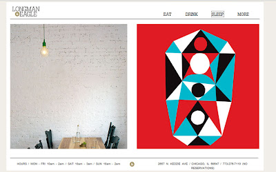
http://longmanandeagle.com/
I enjoy the simplicity and wonderful photography on this page. They offer clear cut choices - eat, drink, sleep, and more. You can find the area you need to go to fast, which allows you time to muddle and play. They include useful information such as menus, room reservations, and also extras such as chef bios.
BLU DOT
http://www.bludot.com/
Again, simplicity, photography and ease of navigation are key. BLU DOT offers a pleasurable shopping experience as well as what I find to be clever interactive features, such as an "experiment" they did with their products. They installed GPS devices in chairs and placed them around New York City. They then tracked where they went and detailed the results on the site with photos and video. Not only can you interact on the site - you could also interact in the world with the "experiment" itself.
Smithsonian: Ocean Portal
http://ocean.si.edu/
This site is informative and clever. The information is geared towards kids but also fun and appropriate for adults. There are different sections for educators as well. Some portions of the page flip like a book and make it extremely enjoyable to muddle through, explore and learn. It makes this site really embody the idea of appropriate.
Inspiring Interaction
MediaBoom is an interactive design and development company. The site has a 1940s tourist aesthetic with maps, pins, coins and pictures all laid out on what resembles an old suitcase. Big band music of the era helps set the scene. The central picture in the stack is a “live” view of a city and visitors can choose whether it’s day or night. Clicking various navigation links will send the viewer zooming through the metropolis towards the corresponding billboard, street level sewer or newsstand, or up to a rotating globe high atop a skyscraper to display various information.
Joan Miro was a prolific surrealist painter and sculptor, producing work through much of the 20th century. MoMA held an exhibition focusing on a single decade in he early life and created a corresponding site. The large number of works is displayed simply, but the real undertaking of the site was the organization of images. Works are grouped by series,
The site’s navigation is logical and highly considered. Options for viewing the work are extensive and practical. The main view groups the works into series such as “Paintings on Unprimed Canvas”, “Collages”, “Constructions and Objects”, and more. Other options include viewing all works chronologically, by relative size, or in an index with all 107 thumbnails visible and grouped by series. A filter containing 22 variables allows the user to narrow the collection based on any combination of various methods, supports, mediums, and materials. This further exemplifies the true experimentation in his methods—he is always trying to reinvent his approach.
Once a viewer clicks on a specific image, they are taken to the Details page where literature and details are found along with an enlarged view of the piece. The image can then be zoomed for even greater detail. Using left and right arrows, the viewer can continuously scroll through the series
When navigating through the site, one constantly switches between one image and many, information and less information. It can be easy to lose track of one’s position within the site. Depending on the link clicked, images zoom on or off the screen in ways that actually aid the viewer by connecting one page to the last. When moving from viewing one large image to viewing many small images, the small thumbnails will slide in as the large image shrinks and moves to its place in the gallery to guide the eye and maintain a line of association.
The only shortcoming of the site is when one is looking at the Details screen of a work the view cannot go back to the thumbnail-view of that series. I found myself wanting to do that a number of times. Instead, left and right arrows move the viewer through that specific series and straight onto the next.
Thunderfuel designs and programs games, animations, and sites. The site resembles a worn, mechanical device that is part conveyor belt, part jukebox. Tasteful pinball machine sound effects are used throughout and add to the of realism various movements and user behaviors.
Inspiring Websites
http://lab.andre-michelle.com/tonematrix
This first site doesn't so much inspire me so much for its design aspects, but I find the interactive part very successful. I believe the matrix is flash based and most likely runs off fairly simple code. However, if you go play around with it, I bet you will waste more then five minuets doing so! I find coming across little sites like these really bring out the best in the web and it makes you wonder how you could turn someone else's creativity into a bigger project of your own.
http://www.theovenreinvented.com/
This is a pretty neat website about something not so interesting in itself, ovens. I really enjoy the mouse response/interaction which makes a normally dull experience, such as shopping for ovens, into something completely enjoyable. The super sleek interface also helps sell the item which is portrayed as a sleek and sophisticated device itself.
http://www.mono-1.com/monoface/main.html
This is a pretty clever website I came across. The first thing I like about it compared to the previous site I talked about, is the fact that it is for pure enjoyment. Also if you go to the root site, mono-1.com it states the idea of simplicity and the beauty it can hold, which is something many people often forget. To many times webpages get junked up becuase the designer feels if there is spaced to be used, then use it.
Saturday, February 26, 2011
Inspiring Web Design
I enjoy the interactive quality of the home page. It’s a great way of seeing what clothing the site has to offer within seconds. It also puts the customers in the position to visualize a wardrobe from themselves. The aesthetics of the site support the style of clothing. Overall, the site is easy to navigate, and the design carries a constancy throughout.
Also, in the page Vintage Loves there is another interactive quality to the images. Depending on how you scroll your mouse over the model she will change positions. It’s another great way to engage customers with the brand, as well as show the clothing from different angles.
I found this websites design to be inspirational because of it’s successful design and concept to represent what the site is about. Without the use of movement or sound, the design itself becomes interactive and engage because it’s textures, colors and concept. I like this site more for it’s unique aesthetics rather than it’s functionality.
http://jasongraymusic.com/site#/tour
This site is inspirational to me because of its constancy and illustrative quality. The navigation, which is the above illustration is repeated on each page. This makes navigating the site easier. It also has options for music and narration that are controlled by the user. Overall, the site is engaging and interesting.
I think what I like about all three of these websites is there distinct style. I have an appreciation for simple and clean design, but I also appreciate how an illustrative style of various line weights, colors and textures can be incorporated into web design. I think what makes this type of style successful is constancy, accessibility in the navigation and the use of negative space. The user needs to be thought of before the aesthetics over powers the functionally of site. I think all three sites merge aesthetics and functionally nicely to produce a clever and pleasurable experience for the user.
Friday, February 25, 2011
Inspiring Interactive Design/Websites
I stumbled upon this website while researching grid-based layout design. This site by Stephen Bau of Design7 looks like a simple layout design template upon first glance but is so much more. The nav bar changes the columns (pretty standard) and the sub menus allow for changes to the script. What I like is each content box is also scripted and contains a wealth of info and links. This site represents to me a hopeful future of web design – an open-source, sharing community of builders.
http://colorschemedesigner.com/
Another website that I came upon in my wanderings is Color Scheme Designer. The site utilizes a top nav bar and bottom menu tabs. Within the content section the color scheme can be altered by
- clicking on each of the small, round color wheels situated above the large wheel.
- clicking on the square blocks of color in the row above the large palette square.
- clicking on the small dark circle in the large color wheel and dragging around the wheel.
- utilizing the bottom tabs to change settings.
My favorite shopping site. One deal, one day. This site is so easy to use. Their buttons are large and labeled. My favorite is during checkout – the button is huge and labeled something like “Click this stupidly large button”. One the right side of the page is a discussion box of wooters (an interesting group) with links to the entries. Below that is section which links to the other subsites for easy browsing. Overall an easy-to-use interface with very entertaining content.
Sunday, February 20, 2011
Questions
Do you do a lot of freelance? if so how do you get yourself work?
What made you decide to work in interactive design?
What was the most important thing(s) you've learned working in this industry that they didn't teach you in school?
What do you look for in someones portfolio?
How long have you worked in this industry?
Wednesday, February 16, 2011
Interaction Design Questions
2) What sites/products/design elements inspire you and show up frequently in your work?
3) Do you find yourself compromising the integrity or usability of a design to please a client or to gain final approval?
4) Do you find that most products require appeal to a wider audience with many companies creating web/mobile/social media campaigns in conjunction with their products and have more demanding requirements to appeal to more cultures, languages, etc.?
5) With social media becoming more popular do you feel there are more design challenges or does it help simplify and streamline designs from the start to be appealing across different applications?
Monday, February 14, 2011
Questions
If so, what challenges have you faced as a freelancer?
Do you forsee that you will remain independent or will you consider joining a firm or company in the future?
What advantages to you have as a freelancer?
What are the pitfalls?
What recommendations can you give someone considering freelance work?
Sunday, February 13, 2011
Questions I would ask
When an interviewer asks you what your weaknesses are, what is a fitting response? What are interviewers/potential employers looking for when they ask that question?
What are some ways you use to deal with the stress of a design job?
I've heard its often a great idea to get a different perspective and work with someone in an unrelated field (like science, history, architecture, etc.). Have you ever done anything like this? If so, were the results surprising/successful?
Thanks to the designers for taking their time to help us out and answer some questions!
Interaction Designer Questions
Questions!
What is a typical day like for a person in this position?
How are teams structured?
What are the potential career paths for a person in this position?
What do you see as the challenges of this position?
Where does this department fit in with the rest of the a company?
What makes the most successful person in this area successful?
Saturday, February 12, 2011
General Questions
How do you see the future of interaction design changing in the next ten years?
What other fields have you worked with in your role as interaction designer?
What sources do you look to for inspiration?
What was your most challenging project and how did you overcome the challenges?
What are some techniques you use to understand an audience?