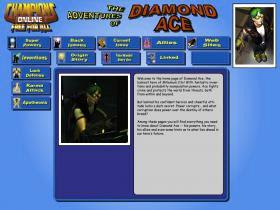

 My website design seems to have held up pretty well after applying the deuteranomaly filter. While it loses a lot of its visual pop, it remains just as legible as before the filter. This is probably due to the reliance on blue shades for most of the backgrounds coupled with high chroma, high contrast red and yellow for the title text. Most of the text also has a dark, sharp-edged drop shadow (and in some cases black outline) which also preserves legibility. This was a natural design choice for a page meant to emulate four-color comic book styles, but it also seems to be a boon for remaining accessible to the color-blind.
No comments:
Post a Comment